Make the right impression
Wayfinding sign scheme for whole estate.
Generator Creative
National Trust, Fountains Abbey team
‘We’re thrilled with the new signage scheme. It’s been a big project to deliver and install and the team at Parc have been fantastic, delivering bespoke signage on a large scale with an eye for detail and thoughtful input into the visitor routes and signage placement. The new signs are not only sympathetic to the landscape but also provide excellent wayfinding information for all our visitors.’ Aimee Rawson, Marketing Manager
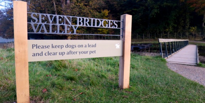
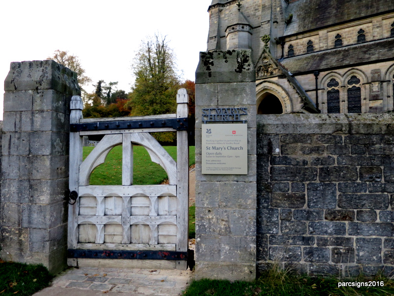
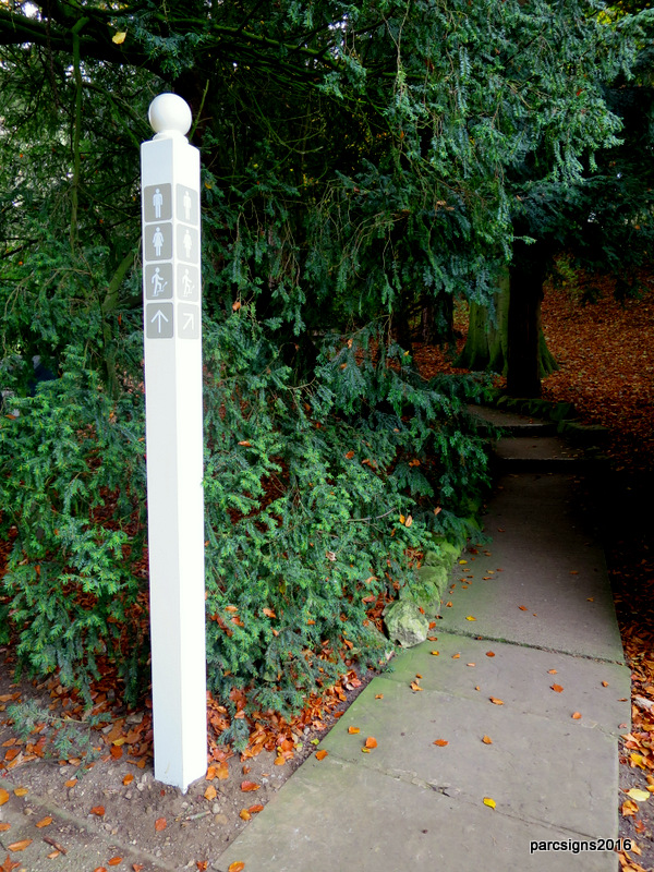
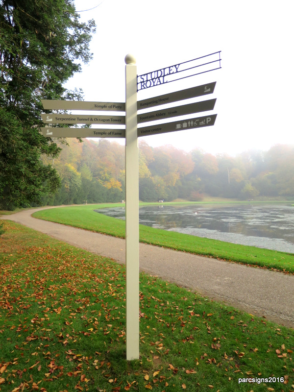
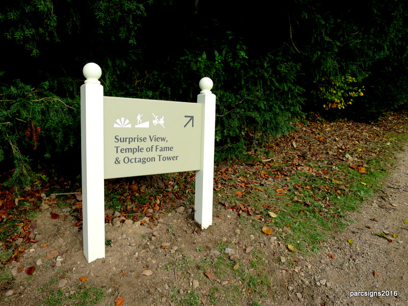
This iconic National Trust site covers 800 acres and encompasses two sites; Fountains Abbey and Studley Royal. Generator Creative had worked with the National Trust team ahead of the sign production phase to develop the Spirit of Place that captured the differences between the two different atmospheres of the Abbey and Studley Royal. Patterns were developed for each area so that visitors would recognise where they were within the estate. It was our challenge to see how best to incorporate these features into the sign scheme working with the most suitable production processes and materials. Not only did we need to consider the patterns for each area but the consistent theme across both was the ‘lock-out’ representing the leaded windows that would have originally been in the Abbey’s windows and is still evident today at St Mary’s Church. It was down to us to our technical team to work out how this could be best produced.
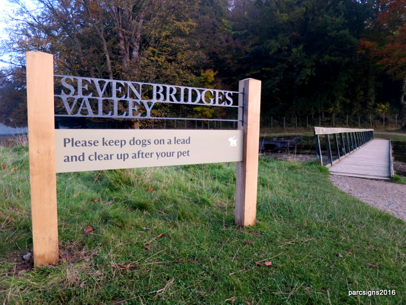
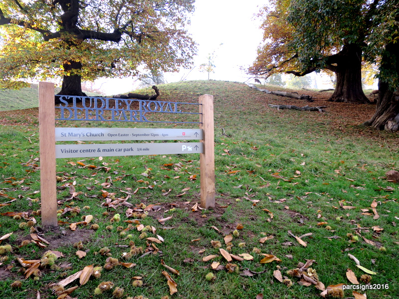
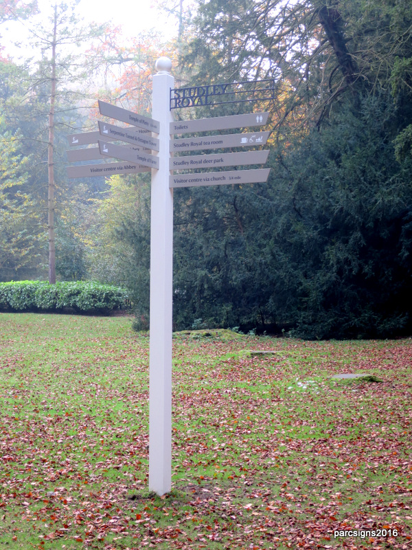
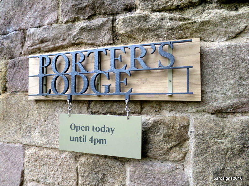
After experimenting with different materials and finishes, producing samples for the client and site visits to look at examples in situ we developed a format for the signage to follow. Oak was chosen as the key material as it will weather to a silver/grey over time and compliment its surroundings. Detail representing the tiles found on the Abbey floor have been engraved into the posts. In Studley Royal the posts follow a different format and are an off white with ball finials that clearly reflect the more playful nature of the water garden area. The distinctive lock-out detail creates a unique feature across all of the signage from post mounted to signs to fingerpointer signs.
A scheme that clearly reflects the themes of the rich history of the estate that provides clear navigation for visitors. Over time the oak will silver to blend in more with the grey of the ‘lock-out’ details which will give a weathered and natural look fitting with their surroundings.